Early Union Pacific Identity
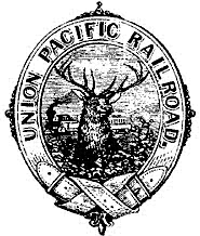
The first Union Pacific logos to appear on the earliest printed materials were typical of the ornate Victorian style of the day. Following the original introduction of the mountain elk logo in 1868, the company logos used from 1871 to 1886 are all illustrated type symbols. For most U.S. industries, it wasn't until the end of this period that the concept of using a single symbol consistently as a company identifier became widespread.
Union Pacific's vigorous start and flourishing early years as it connected the East with the Pacific West would be followed by twenty years of financial difficulties, economic downturn and the 1879 Railroad Debt Crisis. To meet these challenges, by 1884 the Kansas Pacific, Denver Pacific, Oregon Short Line and the Oregon Railroad & Navigation Company had been brought into affiliation with UP. In 1885, UP acquired a financial interest in a consolidated railroad system, including the St. Joseph & Grand Island Railroad.

1868-Mountain Elk Logo
1868
A descendant of the printer's device, this identifying mark appears on the title page of a booklet. Note that the words "Rail Road" appear as part of the company name. The elk and train are symbols still associated with the company.
On May 10, 1869, the Golden Spike was driven at Promontory Summit, Utah, completing the first transcontinental rail connection in the U.S. An advertisement poster of the event featured the mountain elk logo.

T.A. Scott Logo
T.A. Scott takes over the Union Pacific. The T.A. Scott Logo was so named because the logo change occurred during Scott's rise to power; there's no direct evidence of his involvement. Changing a logo, however, is often a way for industry leaders to leave their mark on the company, a practice that continues to this day.

1885 UP logo
1885
Still decorative, the 1885 UP logo appeared during the same year that UP gained interest in the St. Joseph & Grand Island Railroad. UP's fourth logo was a high-contrast black and white version suitable for reproduction in a variety of applications. This universality is a hallmark of the modern logo.

Charles Francis Adams Logo
This delicately engraved logo came into use during the company's reorganization under Charles Francis Adams. Note that the words "Rail Road" are replaced by "Railway," a result of the name change in 1880. The company would be named Union Pacific Railway for 17 years.