An All-encompassing Symbol
Visual confusion between the Corporation, the Railroad and the other subsidiaries reached an end in 1981. The creation of entirely new logos for the Corporation and the other subsidiaries left the original shield to the Union Pacific Railroad Company.

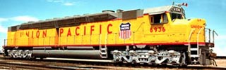
1969 Shield on Centennial DD40X 6936
New Logotypes
To stem confusion between the railroad, the corporation and its other subsidiaries, New York design firm Chermayeff & Geismar created a new corporation logotype. As part of the new design program, new logotypes for the railroad and the other subsidiaries also were created. The goal was to make all subsidiaries distinct, yet connected to the corporation.

Corporate Identifier. The new logotype for Union Pacific Corporation was a "plain vanilla" shield accompanied by the words "Union Pacific Corporation."
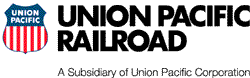
The 1981 Logotype. The 1969 Shield is married to the words "Union Pacific Railroad" typeset in Futura all caps. Appearing beneath is an optional subsidiary tagline. This variation of the logo was used from 1981 to July 1983, and then again from January 1986.