The Modern Logo
Together with the 1881 Trademark Act and the popular Art Nouveau design style, the concept of the modern logo became prevalent in America. Logos became crisp and bold, able to be reproduced in a variety of applications, and used as a single identifying symbol to represent every aspect of the company.
The Union Pacific Shield
From this time on, Union Pacific's logo would be a shield. The shield was chosen as a symbol of strength, and a tie to the company's heritage from the Pacific Railroad Act. Signed by President Abraham Lincoln, the Act fostered UP's construction and opened up the American West.
Which Shield?
During this time, however, UP used multiple official shields. The modern concept of a single logo with the same design integrity was not established by business until the late 1890s. This was partially due to the printing technology of the time that relied on multiple artists in various locations and their individual ability to etch a logo image on metal plates. With the advent of photo-lithography printing, a reproducible single design could be universally used by multiple printers.
During the next 14 years, two shield designs, (3 versions each) were used officially by Union Pacific. The Single Line Shield dominated the period of 1888-1893, and the Double Line Shield from 1893-1897. These set logos are properly named Bend Dexter Shields, so called because the Bend (the stripe bearing the word OVERLAND) tilts upward to the right, or the Dexter side of the shield.

1886 - The First Shield
In 1886, UP vice-president T.J. Potter asked passenger agent Edward L. Lomax to create a patriotic logo conveying the company's heritage from the Pacific Railroad Act. To create the perfect image, Lomax is said to have taken a year to produce 100 sketches of shields.
1887
The first shield was unveiled, which looked like a special agent's or "bullman's" badge and was suspiciously similar to Chicago & North Western's logo. Lomax's shield, however, is considered markedly more "Art Nouveau," a style characterized by curvilinear designs inspired by nature.
The logo was in use only a year. Contrast this with the General Electric logo created during the same time period, which has undergone only one small change to date

1888
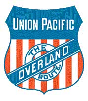
Potter's quest for the patriotic was unsatisfied, so seven months later the shield was revised. Too similar to the Chicago and North Western logo, Lomax was asked to change the first shield and add patriotic colors. The revision placed "Union Pacific" in small capitals on a single line inside the escutcheon, or top half of the shield. UP's common name "The Overland Route." reportedly at first was placed at the bottom and outside the shield, but later put in a round annulet, with the bend tilting dexter (to the right) upward, left to right. Note also the blue outline around the 13 striped paly or lower half of the shield.

1888
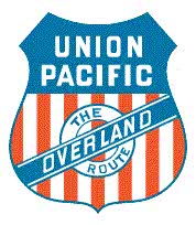
This may have been designed by a printer who did not have the Single Line logo that appeared earlier. Both shields were used on and off officially for nine years, but this one was seen in use as late as 1915. This particular version disappeared in 1889, and then was reborn in 1893. Note the words "Union Pacific" are stacked in the escutcheon. Also the words "The Overland Route" do not end with a period.
Though the single and double-line Union Pacific shields were used simultaneously beginning in 1888, the single-line version was more popular until railroad magnate Jay Gould's death in December 1892, after which the double-line version was used more frequently.

The next Double-line shield differs only from the July 1888 Double-line shield by the use of a period that follows the word "route." This exact shield was used only occasionally in the early 1890s, and was never used again.