Contemporary Style and War
1934
Union Pacific took delivery of the streamliner M-10000 locomotive, putting the company into the world's forefront of popular design. Streamline Styling, a second birth of the poplar Art Deco style, influenced nearly every consumer product in the United States.

1939
At the New York World's Fair, the United States has its first look at Modernism, an influential movement which gave the world the phrase, "Less is more."
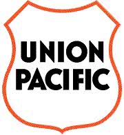
Having the shortest appearance in UP's history, this stark shield was used only three months. The words "Union Pacific" are not drawn, but typeset. Based on its use, the Pearl Harbor Shield was unquestionably a response to the outbreak of World War II, and probably directly influenced by Modernist design.
The Pearl Harbor logo was used on a number of war effort posters and the 1942 timetables between January and April. This logo was in the process of full implementation, but its rollout was cut short by Union Pacific President W.M. Jeffers. On April 18, 1942, Jeffers directed that the logo be returned back to the old Overland logo, though it would "entail quite an expense" to do so. The Pearl Harbor logo never appeared on any locomotives or rolling stock.

1942
Just a few days after ordering the "Pearl Harbor" logo be returned to the 1904 Harriman Shield, Jeffers changed his mind and ordered the old logo to be streamlined by dropping the Overland bend and annulet. In this case, streamline refers to the ubiquitous design style in the U.S. rather than to streamliner trains. Removing the "Overland Route" was made in deference to the increasingly modern and enlarged nature of the railroad. Dropping the Overland bend and annulet, the colors of the 13 stripes were more efficiently shown. Note the return of quirky hand-drawn lettering in the escutcheon.