Post-War Modernism
The end of World War II brought a significant design change to the US. Many of the world's talented designers came to America bringing with them a sophisticated form-and-function design approach. Accelerated by economic expansion, this Modernism immediately and forever changed American corporate communications. CBS and IBM are among the companies that redesigned their identities in this style; Union Pacific and the New Haven and Hartford were among the earliest railroads to develop modernist logos.


1950
Created by two graphic designers at an advertising agency for $50, this shield follows the modernist style. The shield shape is updated and regularized. To increase legibility, the hand-drawn lettering was replaced by Futura, a European type design. The decision to change the logo was made by E. Roland Harriman in August 1949, while reviewing the 1950 advertising campaign. The word "Railroad" was added to remove any doubt of what Union Pacific was.
This shield is the basic shield shape of the company's logo in current use today.

1962
Stoddard Logos
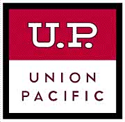
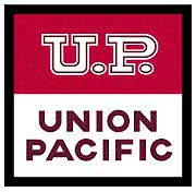
These "Campbell Soup" logos lasted only ten months. This square "shield" is a darkish red on top with white and brownish-purple inline initials "U.P." The bottom half is white with brownish-purple lettering, which gives it a Campbell's Soup label appearance. The entire logo is bordered by a thick black line.
The brainchild of C.H. Mertens, UP's General Advertising Manager, the new logo appeared in advertising campaigns and on box cars. In a October 12, 1962, memo to President Stoddard, Mertens cited competition with other railroads who had just updated their logos, as the reason for changing the shield. He proposed permanent adoption of this logo, while usage of the 1950 Shield be relegated to a few print and signage applications. At least two versions were painted on rail cars.

Not satisfied with the first effort, by September 1962, all the lettering was reworked to create a bolder impact. The UP initials were given a white outline, creating a purple inline. The lower words were redrawn in a quirky but much bolder lettering.
The Campbell Soup Shield logos were never fully adopted or their design never fully completed. This logo was used with other UP logos from same time period, adding to the confusion. The Stoddard logos also included a third version shown in use along side a "winged logo" and the 1969 shield.
Judging the Campbell Soup Shield unsuccessful, Stoddard orders it abandoned, returning to exclusive use of the 1950 Shield.
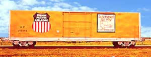
Boxcars of the day were imprinted with the Campbell Soup Shield to the right of the door, with an "Automated Rail Way" map to the left. Both the logo and map had a black border around the image. By 1963, the Campbell Soup Shield was dropped and replaced by the 1950 Shield.
